[A, SfS] Chapter 1: Sampling, Descriptive Statistics, Intr: 1.8: Quartiles
 Quartiles
Quartiles
In this lesson you will learn:
- What quartiles are and how to calculate them.
- What the inter-quartile range is and how to calculate it.
- What the five-number summary is.
- What a boxplot is and how to construct it.
#\text{}#
Another common method to get a better understanding of how a data set is distributed is to divide the data into a number of equal-sized parts. If the data set is divided up into four parts, the resulting cut-off points are called quartiles.
Quartiles
Quartiles divide a sorted data set into four parts, such that each part contains #1/4# of all the elements in the data set.
Quartile Calculation
The calculation of quartiles starts by ordering the scores in the distribution from smallest to largest. Next, to find the index #i# of the #Q^{th}# quartile, use the following formula:
\[i=\dfrac{Q}{4}(n-1)+1\]
where #n# is the total number of scores in the data set and #Q# is a value between 1 and 3.
It is important to note that the formula above is used to determine the location of the #Q^{th}# quartile and not the value associated with it.
If #i# is an integer, then the #Q^{th}# quartile is the score located at the #i^{th}# position of the ordered data.
Whenever #i# is not an integer, linear interpolation is used to calculate the quartile:
- Find the two integers closest to #i# by rounding #i# up and down. These indices are denoted by #i_{above}# and #i_{below}#, respectively.
- Determine the values located at these positions. These values are denoted by #X_{above}# and #X_{below}#, respectively.
- Calculate the #Q^{th}# quartile with the following formula:\[Q^{th}\text{ quartile}=X_{below} + (i - i_{below}) \cdot (X_{above} - X_{below})\]
To calculate the #2^{nd}# quartile, first sort the #n=21# values in ascending order:
\[1,\,\,\,1,\,\,\,4,\,\,\,4,\,\,\,5,\,\,\,6,\,\,\,6,\,\,\,7,\,\,\,9,\,\,\,10,\,\,\,12,\,\,\,13,\,\,\,13,\,\,\,15,\,\,\,17,\,\,\,17,\,\,\,17,\,\,\,17,\,\,\,22,\,\,\,23,\,\,\,24\]
Next, to find the index #i# of the #2^{nd}# quartile (#Q=2#), use the following formula:
\[\begin{array}{rcl}
i &=& \cfrac{Q}{4}(n-1)+1\\
&=& \cfrac{2}{4}(21 - 1) + 1=11
\end{array}\]
Since #i=11# is an integer, the #2^{nd}# quartile is the score located at the #11^{th}# position of the ordered data:
\[Q_{2}=x_{11} = 12\]
#\text{}#
One particularly useful measure that can be derived from the quartiles of a distribution is the inter-quartile range.
Inter-Quartile Range
The inter-quartile range #(IQR)# is the difference between the first quartile and the third quartile of a distribution.
\[IQR = Q_3 - Q_1\]
The inter-quartile range thus measures how spread out the middle #50\%# of the data are.
Classifying Outliers
The #IQR# can be used as a way to classify measurements as outliers. Under this convention, we say that the measurement is an outlier if:
- It is less than #Q1 - 1.5*IQR#, or
- It is more than #Q3 + 1.5*IQR#.
Some statisticians distinguish moderate outliers, identified using the criteria above, from extreme outliers by replacing the #1.5# with #3#.
#\text{}#
Quartiles can also be used to construct a so-called five-number summary.
Five-Number Summary
The minimum value of a data set is thought of as the null quartile, denoted #Q_0#, and the maximum value is thought of as the fourth quartile, denoted #Q_4#.
The quartiles #Q_0#, #Q_1#, #Q_2#, #Q_3# and #Q_4# together are called the five-number summary for measurement on a quantitative variable.
#\text{}#
Note that all quartiles are special cases of quantiles.
Quantiles
For quantitative data, the #\boldsymbol{q}#th quantile is any number such that #100q# percent of the data fall at or below that number.
The first quartile is the #0.25# quantile, because #25\%# of the data fall at or below the first quartile. The median is the #0.5# quantile, and the third quartile is the #0.75# quantile. The minimum and maximum can be thought of as the #0.0# quantile and #1.0# quantile, respectively.
Meanwhile, the #0.43# quantile is a number such that #43\%# of the data fall at or below it, and the #0.87# quantile is a number such that #87\%# of the data fall at or below it.
#\text{}#
If #p = 100q# then we can refer to the #q#th quantile instead as the #p#th percentile.
Percentiles
Percentiles divide a sorted data set into one hundred parts, such that each part contains #1/100# of all the elements in the data set.
The #0.64# quantile is the #64#th percentile, and the #0.29# quantile is the #29#th percentile.
If in a national exam your score is at the #95th# percentile it means #95\%# of the people who took the exam scored at or below your score (i.e., you did very well!).
#\text{}#
We discussed previously that a histogram is a useful way to visualize the distribution of quantitative variable. Using the quartiles, there is an alternative to the histogram which is also commonly used: the boxplot.
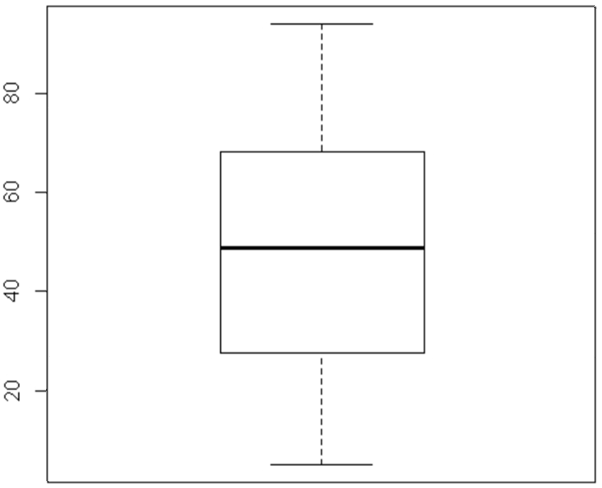
Boxplot
A boxplot uses just one axis (usually vertical) to represent the numerical scale of the variable. The boxplot consists of a rectangle of arbitrary width with one side at #Q_1# and the other side at #Q_3#, and a thick line inside the box at #Q_2# (the median).
Then from the bottom of the plot, we extend a line to the minimum value of our data set, excluding any outliers, while from the top of the box we extend a line to the maximum value of our data set, excluding any outliers. These lines are often called whiskers. Any outliers are represented by separate points.

This boxplot shows that the measurements have a symmetric distribution with no outliers.
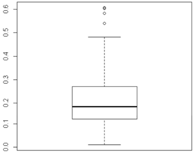
This boxplot shows that the data are skewed to the right (because the top whisker is longer than the bottom whisker, and the median is closer to #Q1# to #Q3#), with #4# outliers at the high end.
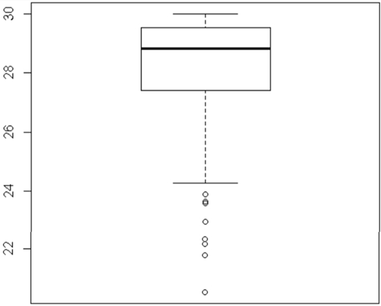
This boxplot shows that the data are skewed to the left with many outliers.
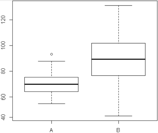
These are side-by-side boxplots. We can compare the same variable for two different groups (#A# and #B#).
We can see that the median of the variable in group #B# is greater than the median of that variable in group #A#, and we can also see that the spread of the measurements in group #A# is much smaller than the spread in group #B#. But both distributions appear symmetric, with one outlier in group #A#.
#\text{}#
Using R
Five-Number Summary
Suppose you have measurements on a quantitative variable stored in a numeric vector named #\mathtt{Salary}# in your #\mathrm{R}# workspace.
To find the minimum, first quartile, third quartile and maximum, respectively, the #\mathrm{R}# functions are:
> min(Salary)

> quantile(Salary,0.25)

> quantile(Salary,0.75)

> max(Salary)
#\text{}#
However, you can obtain all of these quantities, and the mean and median, in one go, using the #\mathtt{summary()}# function:
> summary(Salary)
#\text{}#
Inter-Quartile Range
You can find the inter-quartile range either by subtracting the first quartile from the third quartile, or more efficiently by using the #\mathtt{IQR()}# function:
> IQR(Salary)
#\text{}#
Quantiles
If you want the #q# quantile of the #\mathtt{Salary}# data, i.e., the #p = 100q# percentile, use the #\mathtt{quantile()}# function:
> quantile(Salary,q)
#\text{}#
Percentiles
If you want the percentiles from #10\%# to #90\%# incremented by tens, you could use:
> quantile(Salary,seq(0.1,0.9,by=0.1))
#\text{}#
Boxplot
If you want to make a boxplot of this variable, use the #\mathtt{boxplot()}# function:
> boxplot(Salary)
#\text{}#
Side-by-Side Boxplots
If you want side-by-side boxplots, with a separate boxplot for each of two or more groups situated next to each other, you need a second vector in #\mathrm{R}# which indicates to which group each measurement belongs. This vector can be a character vector or an integer vector. Suppose the vector is named #\mathtt{Group}#. Then use the boxplot function in this manner:
> boxplot(Salary ~ Group)